Magali Castel
During my studying years, I never worked on a big printing project (with many pages, I mean).
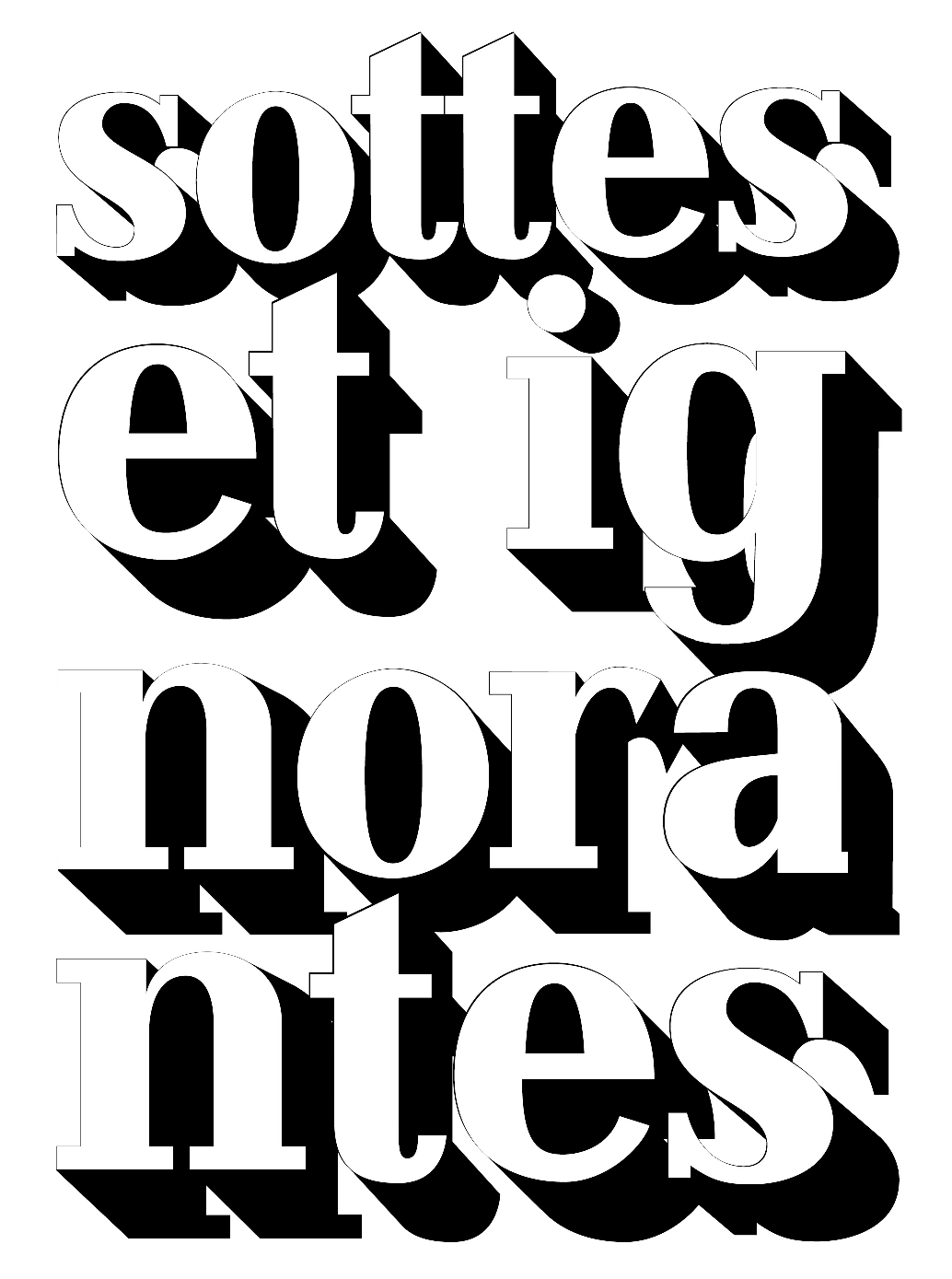
I also felt like lettering was something
I wanted to explore.
So I crossed the both.
So this is a very personal edition of
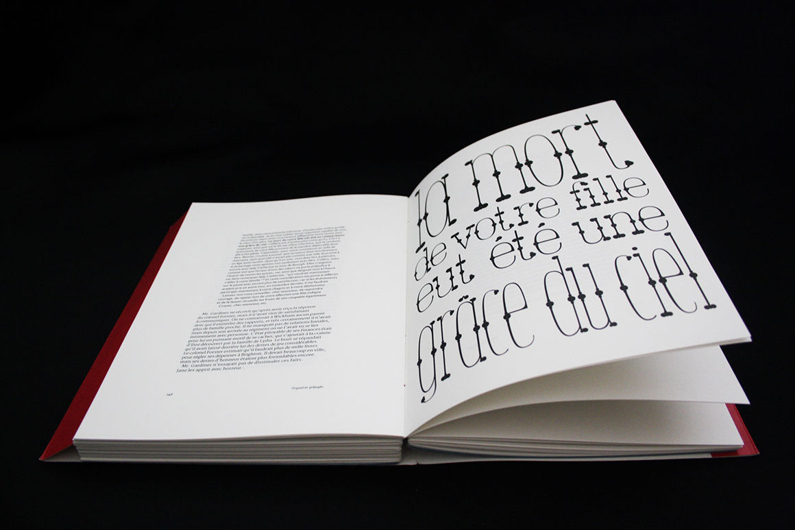
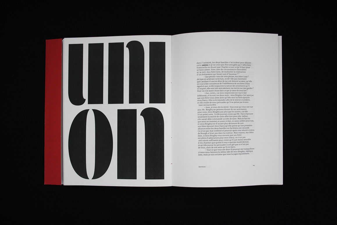
Pride & Prejudice
in French (sorry)
First Impression
2017
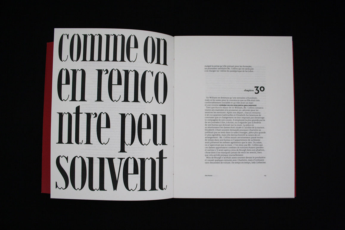
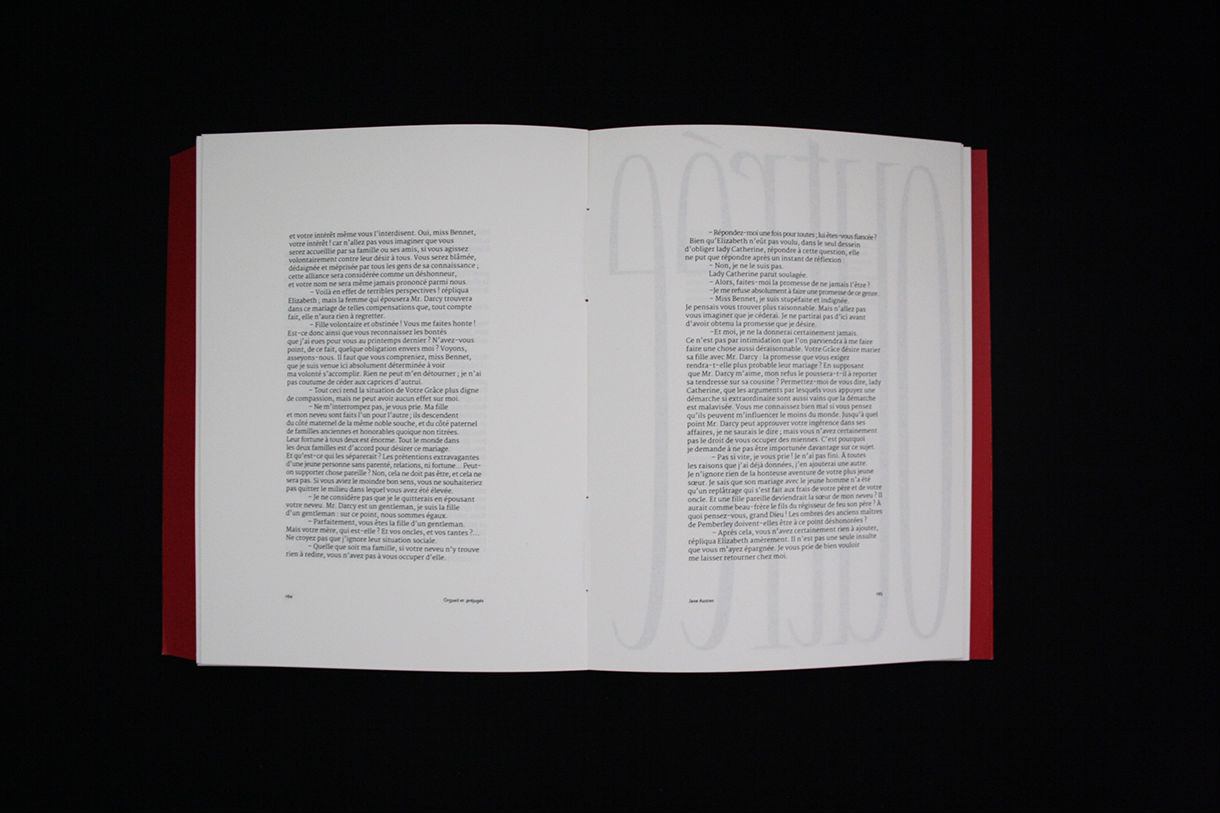
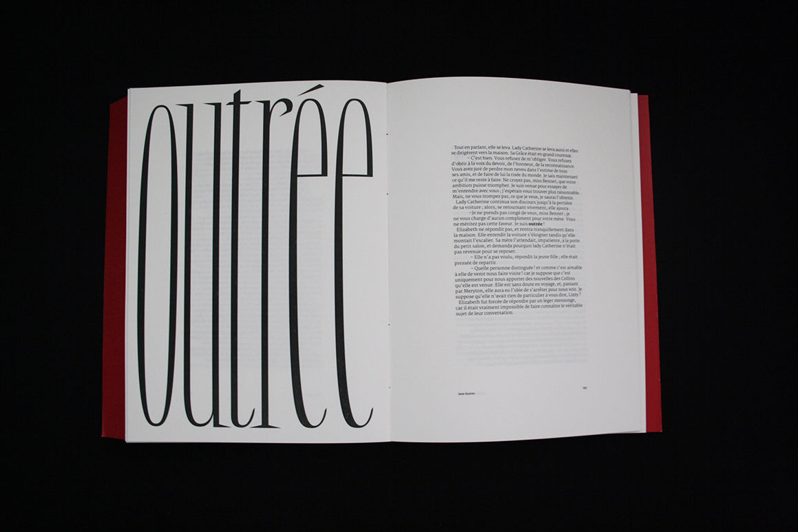
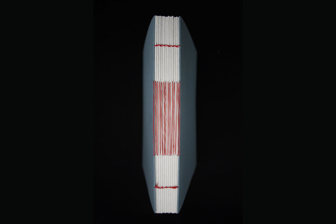
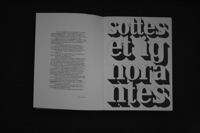
Gradutation project working on a edition of Pride & Prejudice including lettering
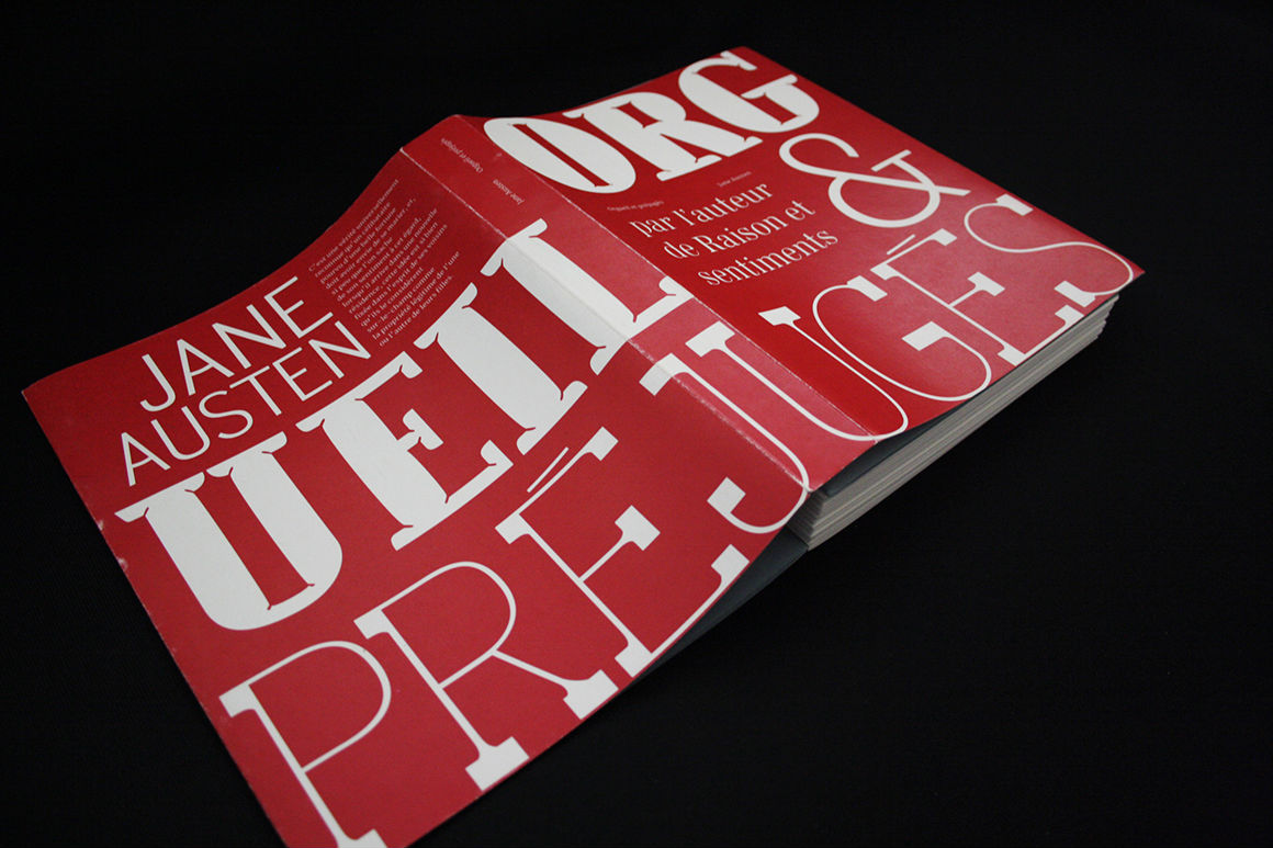
Jane Austen novels are often showed as very girly, romantic, easy-to-read litterature (with pink and flowers on the cover). But even though it is about love interest, it is also full of humor and has a wide range of characters.
The lettering's shapes echos with the way the extract is said or the context in which it is said. And gives an extra level of interpretation to the reader.
Feel free to reach out, even just to say hi at hello@magalicastel.com
Magali Castel copyright © Paris — 2019